How To: Choose Grout Color with Monica Chavez
Posted August 10, 2021
Guest post by Monica Chavez, House of Esperanza
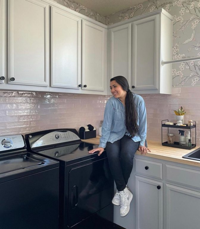
Hi! It’s Monica from House of Esperanza and I’m here to show you how I used Jeffrey Court’s new Rosie Posie tile alongside the Midnight Hex Mosaic in my laundry room renovation to create a balance of feminine and masculine tones.
ProTip: Using tile in spaces other than your kitchen and bathrooms helps to create a custom look adding value to your home. And a pretty place to clean up all the dirt on clothes.

The laundry room is a place where I spend a lot of time, and updating the look and feel of it was important to me. Replacing the builder-grade finishes and vinyl flooring with a modern color palette that fits my style is going to make laundry days more pleasant

When Jeffrey Court released the Rosie Posie tile, I knew I had to use it in my home. I love a subtle pink and pairing it with my go-to neutrals of black and gray created a neutral feeling room.
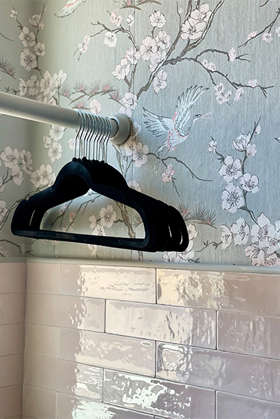
I found a wallpaper that brought all of my design elements together perfectly and had a touch of the Rosie pink. It paired beautifully with the tile and I even had the cabinet paint color-matched to the gray in the wallpaper
ProTip: Naturally pull a space together with similar elements to complement each other. Like Monica did with pulling colors from the wallpaper bringing them to life with other materials such as paint and tile.

But I didn’t stop there, I chose a grout color for the Rosie Posie tile that matched the wallpaper gray as well. This created grout lines that blended in with the surrounding walls and allowed the color and texture of the tile to be the star.
One way to highlight the craftsmanship and details in a tile is to refrain from drawing attention to the layout pattern or grout lines. You can do this by using a grout that will not drastically contrast against the tile. This can be done by using a similar grout color to the tile being used or by using a neutral grout color like I did here.

I applied this same principle for the Midnight Hex Mosaic used on the floor. By using black grout I was able to highlight the organic marble veining in the mosaic. If I had used a more contrasting grout, attention would instead be drawn to the hexagon shape.
The dark flooring grounds the entire space and the gray cabinets with Rosie walls bring my eyes up to the wallpaper.
ProTip: Combining a light-colored tile, like Rosie Posie with a dark floor tile allows a space to not feel overly feminine, perfect for when you have two design styles to incorporate in the same space.

Thinking about the necessary parts of a tile install, like grout, from a design perspective allows you the ability to control what parts of a tile you’d like to highlight. Instead of an afterthought, it can be a well-thought-out part of the overall design.

I hope this tip allows you to approach your next tile project with a little more intention!
See more inspiration from Monica here.


Comments are closed here.